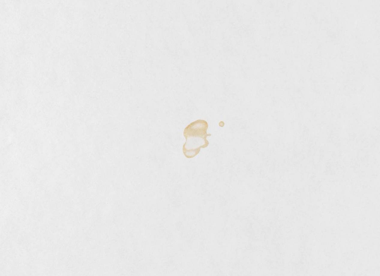
Ed Ruscha’s 1969 print portfolio Stains signifies a paradigm shift in the artist’s practice, marking a departure from painting in favor of experimental printmaking using ephemeral materials. An experiment in West Coast Conceptualism, each of the portfolio’s seventy-five pages of cotton paper was permeated with an unusual pigment, which included Los Angeles tap water, Coca-Cola, sulphuric acid, and human blood.
Understanding the material culture of ephemeral prints is a contradiction in terms, yet research into the production, function, and reception of ephemeral materials in printmaking has recently become a fertile line of enquiry. From the early modern period, to artistic interest in materiality in 21st century practices, recent theoretical approaches to matter offer new insight into the production and consumption of prints historically. Questioning print’s plasticity or ephemeral materiality as an indicator of ‘expanded print’, includes the conservation and documenting of Day-Glo, Early 20th-Century Pulp Fiction Illustration, and Miraculous Early Modern Prints in Italy.
As part of the College Art Association’s annual conference, Sotheby’s Institute faculty Dr. Yasmin Amaratunga Railton is chairing a discussion about the intersection of art history, museumology, conservation. The topic covers the relationship between artists’ choices of ephemeral materials and the theoretical rhetoric that dominated their practices, New Materialisms, object orientated ontology, or thing theory may offer new ideas of ephemeral matter. From a museology perspective, various models of institutional support that encompass archival repositories, preservation and conservation. Focusing on the physical history of ephemeral prints, the conception, acquisition, condition issues and conservation. Technical conservation examinations of prints illustrate the challenges presented by ephemeral pigments. At the intersection of art history, conservation, and archival theory, Dr. Railton’s session seeks to contribute new knowledge on materialism by situating ephemeral materials and printmaking practices within current art historical research and criticism. Here’s a look at the perspectives:
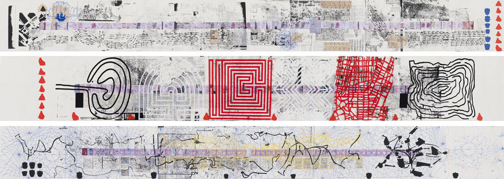 Rikrit Tiranvanija, Map of Land and Feeling, 2008
Print’s plasticity or ephemeral materiality as an indicator of “expanded print”?
Ruth Pelzer-Montad, University of Edinburgh
The information for “Print/Out”, the last big print survey exhibition at MOMA New York in 2012, mentioned artists such as Rirkrit Tiravanija and Philippe Parreno, who “have used prints to recount, share, or reactivate earlier events and ephemeral artworks.” In other words, prints become part of a mobile art practice but their own volatility appears here unchanged. Similarly, in his essay for “Philagrafika”, the groundbreaking print exhibition in Philadelphia in 2009/10, its chief curator José Roca stated: “For the sake of consistency, we considered a print anything that had three components: a matrix, a transfer medium, and a receiving surface.” However, his follow-on sentence already indicated that this seemingly firm material triumvirate is anything but fixed: “This could be, for example, a plate, ink, and paper; a digital file, laser-cut vinyl, and the walls and floors of an exhibition space; a silk-screen, charcoal dust, and water.” Other recent writers on print, such as Johanna Drucker (2013), have taken the inquiry into the materiality of works of art (including prints) further by speaking of the art object as an “event”, “an instantiation, a temporally and spatially ephemeral ‘thing’”. Rather than following Drucker’s line of argument by focussing on multi-part or “distributed” works that may or may not include prints, my presentation will demonstrate that the critical interrogation of notions of materiality manifests even in relatively conventional modes of contemporary print practice that adhere to the “three component” model, by incorporating ephemerality into processes and materials.
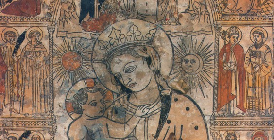 Detail of Forlì’s Madonna of the Fire, 15th century
Miraculous Early Modern Prints in Italy: 1500-1600
Margherita Clavarino, Warburg Institute
This research focuses on Early Modern prints in Italy which were believed to have miraculous powers. The art historical perspective allows a closer observation of the printed image from 1500-1600, which is perhaps the largest group within the category of miracle-working objects. Generally, miraculous prints could be divided into two categories: the ones which act (heal) and the ones which change (cry or bleed). The second ones can be considered ephemeral because of their changes. The miracle consists of the changing of the image, which is usually temporary. The emanation of body liquids, such as blood and tears, is a frequent phenomenon. Lastly, there are those miraculous prints which are copies after more famous miraculous artworks. Even the cheapest and humblest colored prints can be as miraculous as their prototypes. As a consequence of their thaumaturgic powers, these ephemeral prints are often transformed by decorations, such as frame of seashells and cherubs, into something more precious and permanent. Although very few impressions survive today, more attention should be paid to the neglected print medium. During the 2000s miraculous images became the focus of sustained scholarly enquiry but little has been specifically written about miraculous prints with the exception of Pon’s A Printed Icon in Early Modern Italy. Forlì’s Madonna of the Fire. It offers great insight into the individual work and its singular story but without examining the broader category of miraculous prints to which the woodcut belongs, leaving the door open for a more systematic study.
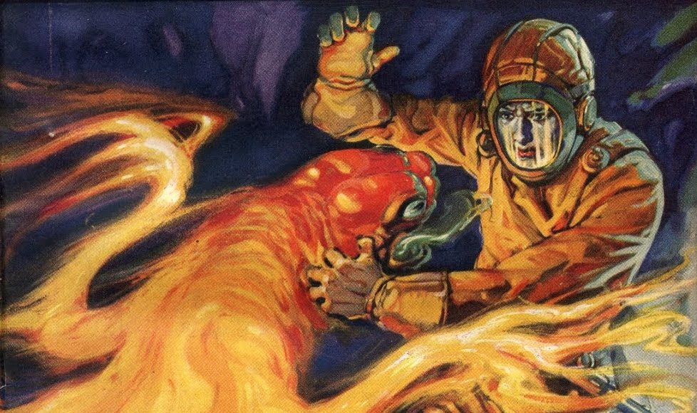 Argosy All-Story Weekly cover illustration by Robert A Graef (September 23, 1933)
Coloring the Mind: Early 20th-Century Pulp Fiction Illustration, Fantastic Subject Matter, and the Photomechanical Revolution
James Denison, University of Michigan
Pulp fiction bloomed into life as a literary genre in the first decades of the twentieth century, when hundreds of vividly illustrated pulp titles flourished and well-known magazines like “The Argosy” and “The All-Story” sold as many as a million copies per week. Whereas earlier forms of American popular fiction typically offered romanticized visions of everyday life and recent American history, pulp magazines brought more imaginative genres, including science-fiction, horror, and fantasy, into the mainstream. This paper contends that the development of cheaper photomechanical color printing techniques in the late 1800s and the subsequent exploitation of these techniques by popular fiction illustrators and editors, whose products were sold on poor-quality “pulp” paper at dirt-cheap prices and with razor-thin margins, played a key role in the popularization of fantastic fictions in the early twentieth century. During this period, illustrators were compelled to fashion lurid, dramatic covers which simultaneously propelled sales in a crowded mass entertainment market and opened the door to theretofore unknown imaginative possibilities in the stories they advertised. The pulps’ vivid, dramatic cover illustrations made envisioning exotic lands, bodies, or phenomena that much easier, and consequently made the fantastic stories that the magazines peddled seem that much more real. Using illustrations produced to accompany Edgar Rice Burroughs’ bestselling “planetary romance” series, “Barsoom”, and period commentaries from pulp readers, writers, illustrators, and editors, I argue that novel production methods enabled early twentieth-century popular fiction magazines to offer readers a means of escape into newly fantastic and concrete imagined worlds.
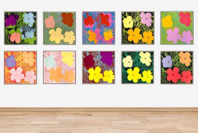 Andy Warhol, Flowers (portfolio of 10), 1970
Documenting DayGlo®
Margaret Holben Ellis, Institute of Fine Arts New York University
Originally intended for industrial usage, daylight fluorescent colors, popularly known as DayGlo®, are now incorporated into many categories of works on paper, including printing inks and printmaking papers. Most often associated with the Pop Art movement of the 1960s, daylight fluorescent colors have been used as artistic media ever since; artists include Peter Halley, Robert Rauschenberg, Robert Stanley, Andy Warhol, Frank Stella, Keith Haring, and many others. The provocative visual message of DayGlo stimulates both a physiological as well as psychological response, due to the fact that the colors emit more visible light than they take in. Therefore, we perceive and respond to them as unnatural and modern. It is known that daylight fluorescent colors change in appearance over time. To the human eye, they appear to either darken or fade. If darkened, the colors look “dead,” due to a decrease in fluorescence. If faded, it is most likely the coloring material itself. In fact, both aging mechanisms probably happen simultaneously. Such gradual and subtle manifestations of aging are difficult, if not impossible, to ascertain using the human eye. Documenting the visual and invisible changes that occur in DayGlo colors via optical instrumentation or photography has been to date impractical. This presentation will begin by illustrating how DayGlo printing inks age from exposure to light followed by a suggested documentation protocol, using recently introduced UV-imaging targets, which can be used to accurately monitor color and fluorescence shifts.
Featured image: Edward Ruscha, Stains, 1969